Process Book
↓
Project Break Down
Research
During the research phase, I took several jewelry brands' websites for reference. The studies mainly focus on the proportion of negative space in product photos, visual design, and web flow. I also compared the differences in the visual communication of products at different price ranges.
Ideation
In the next stage, I came up with five sets of sketches based on the usage habits of the target audience as much as possible. Then arranged the web flows with low-fidelity and high-fidelity wireframes respectively.
Development
In order to restore the appearance of the design to a high degree during the development stage, the scale is measured accurately before the coding process begins. A unified design system is used to achieve a reusable code.
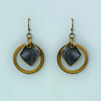
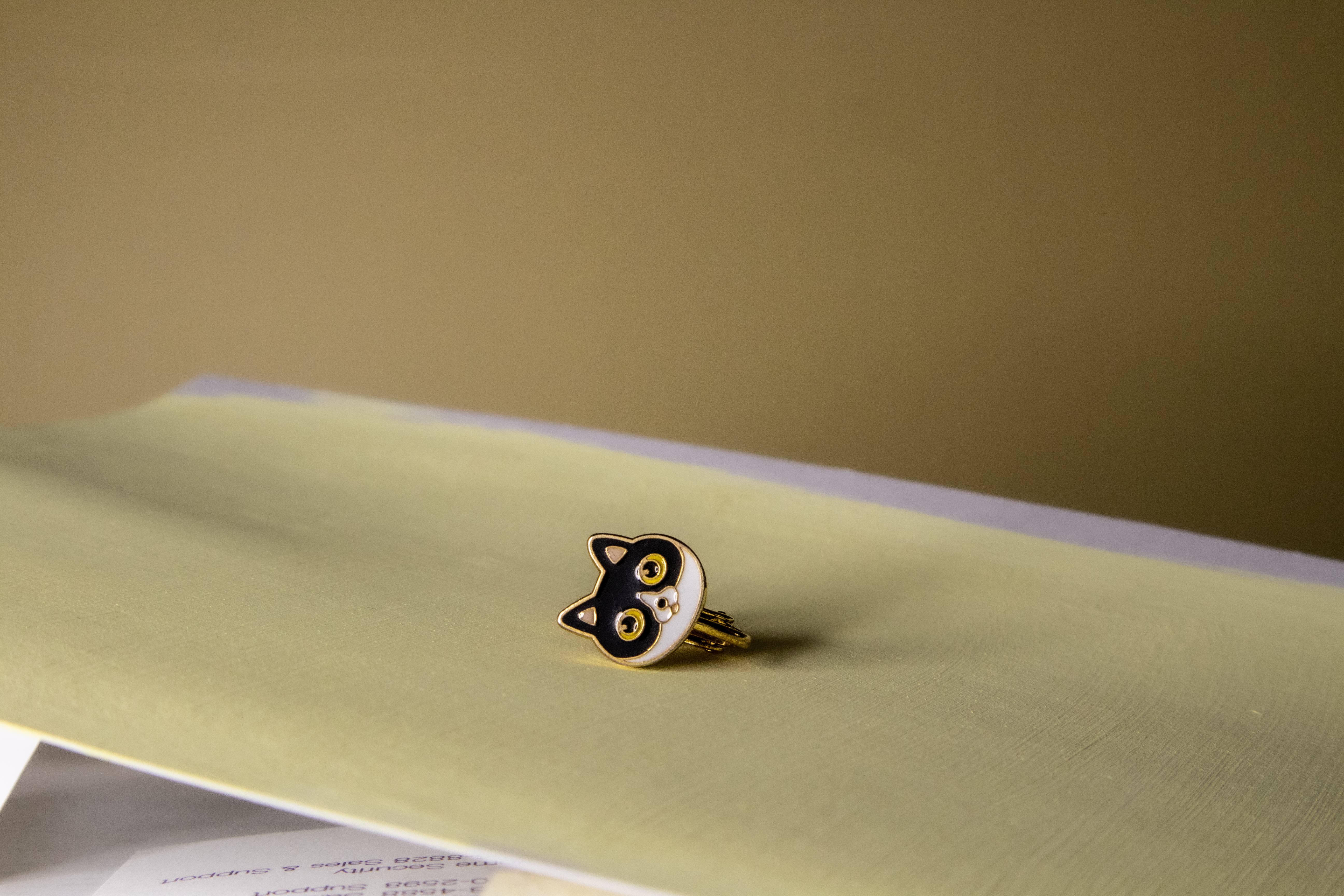
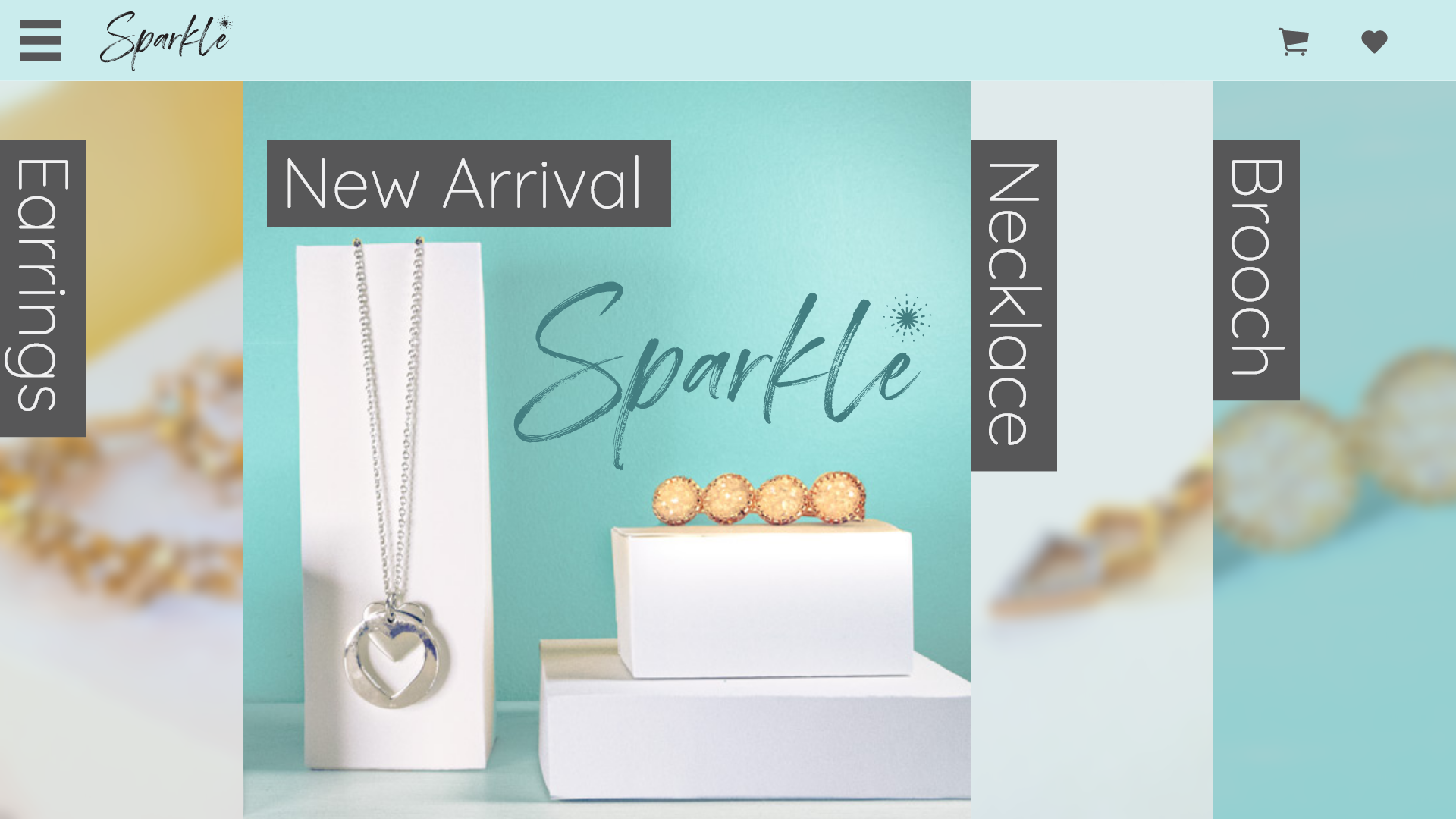
Brand Material
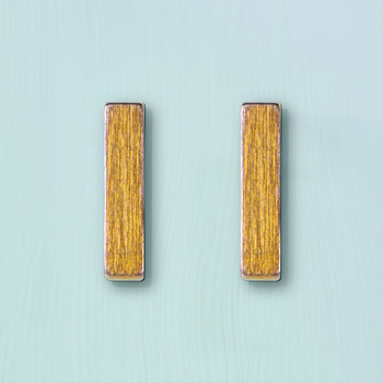
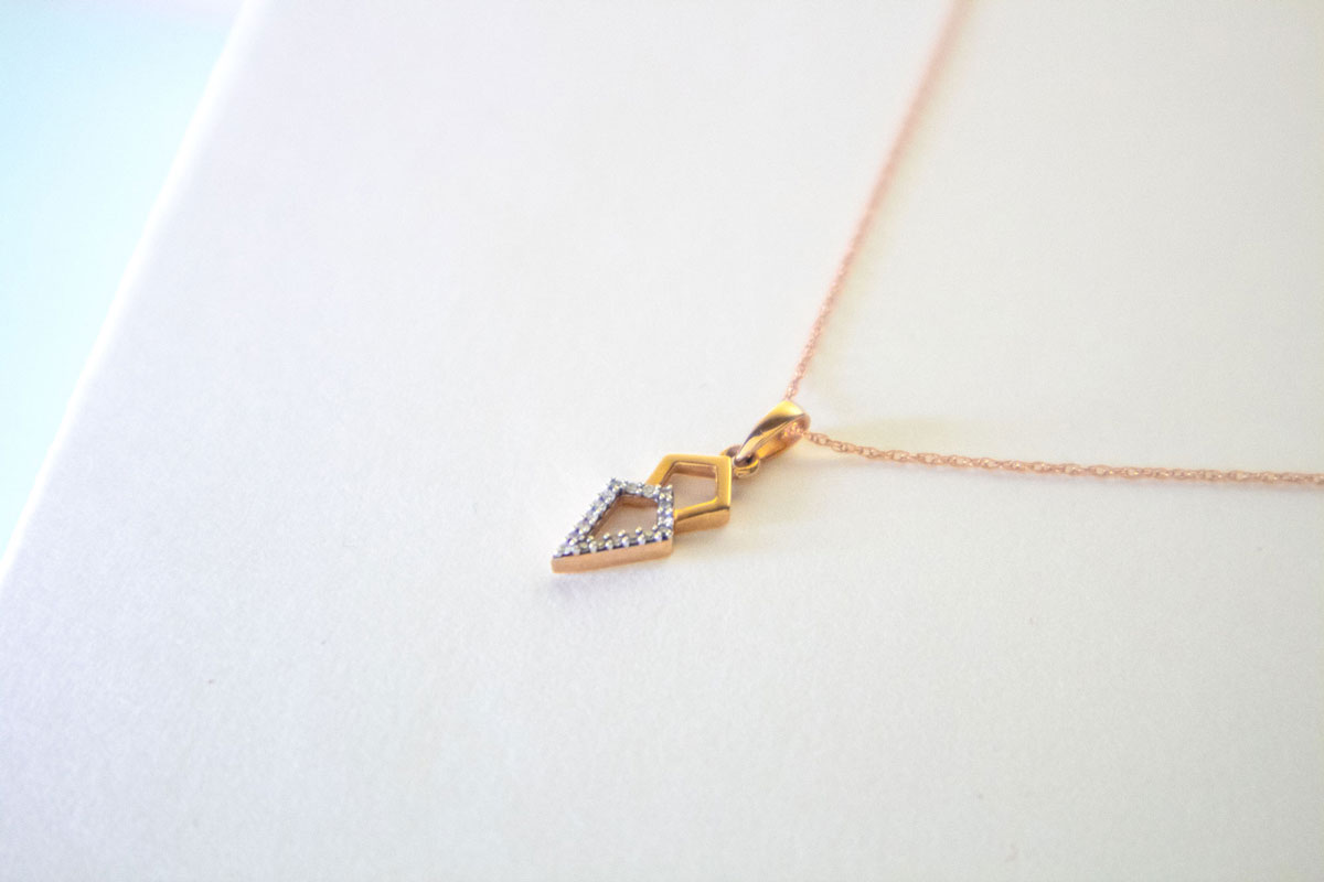
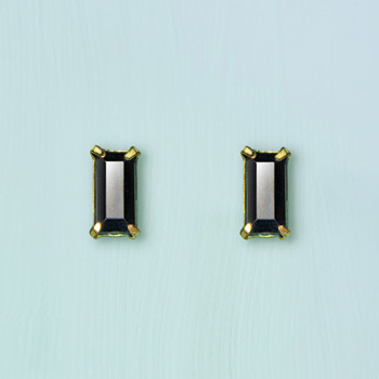
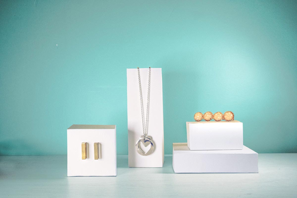
The information available for this project is the corporate colour scheme, logo and font, but no other information is provided. Therefore, I positioned this brand as a low to medium-priced fast-fashion jewelry brand. Considering consumers of this kind of brand want to buy products quickly, I thought it was important to show the size and material of the products clearly in the photos, so I deliberately did not cut all the products to the same scale.

Persona
I did not have the opportunity to conduct a user survey for this project. Luckliy, I researched a variety of data during the research phase and used it to categorize the five categories of Sparkle's potential customers. Among them, Andrea is the major customer persona, whose main characteristic is their highly action-oriented nature.
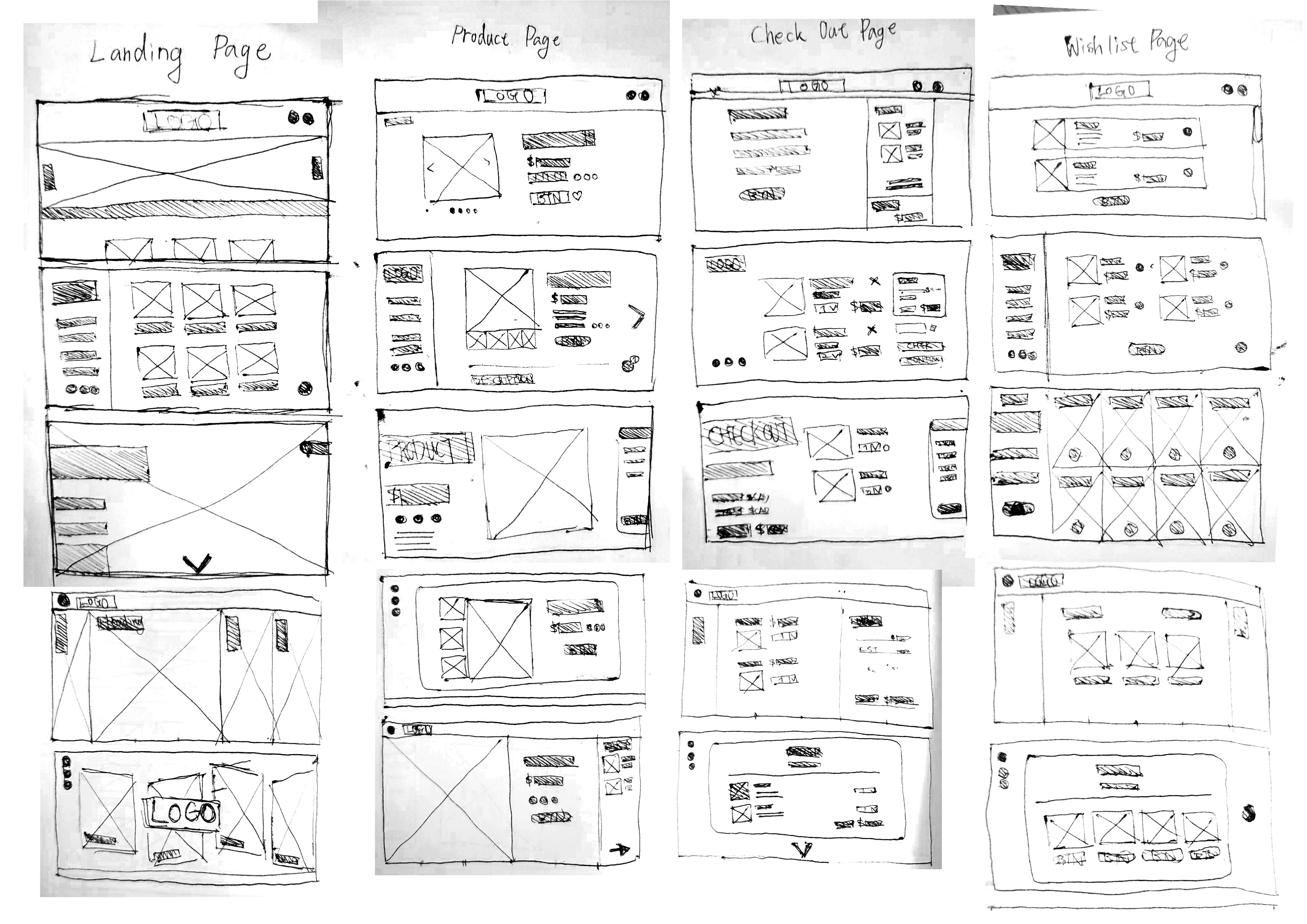
Thumbnailing
During the thumbnailing stage, I designed five sets of web flows. From the first row onwards, they are
- Traditional e-commerce, which most consumers are used to.
- Common layout of clothing brands, suitable for websites with a large amount of information.
- A more modern design to distinguish from other websites.
- Modular design, providing high usability and clear information.
- Information card type of design, which can be highly interactive.
Among these thumbnails, I chose the fourth option to refine into wireframes.
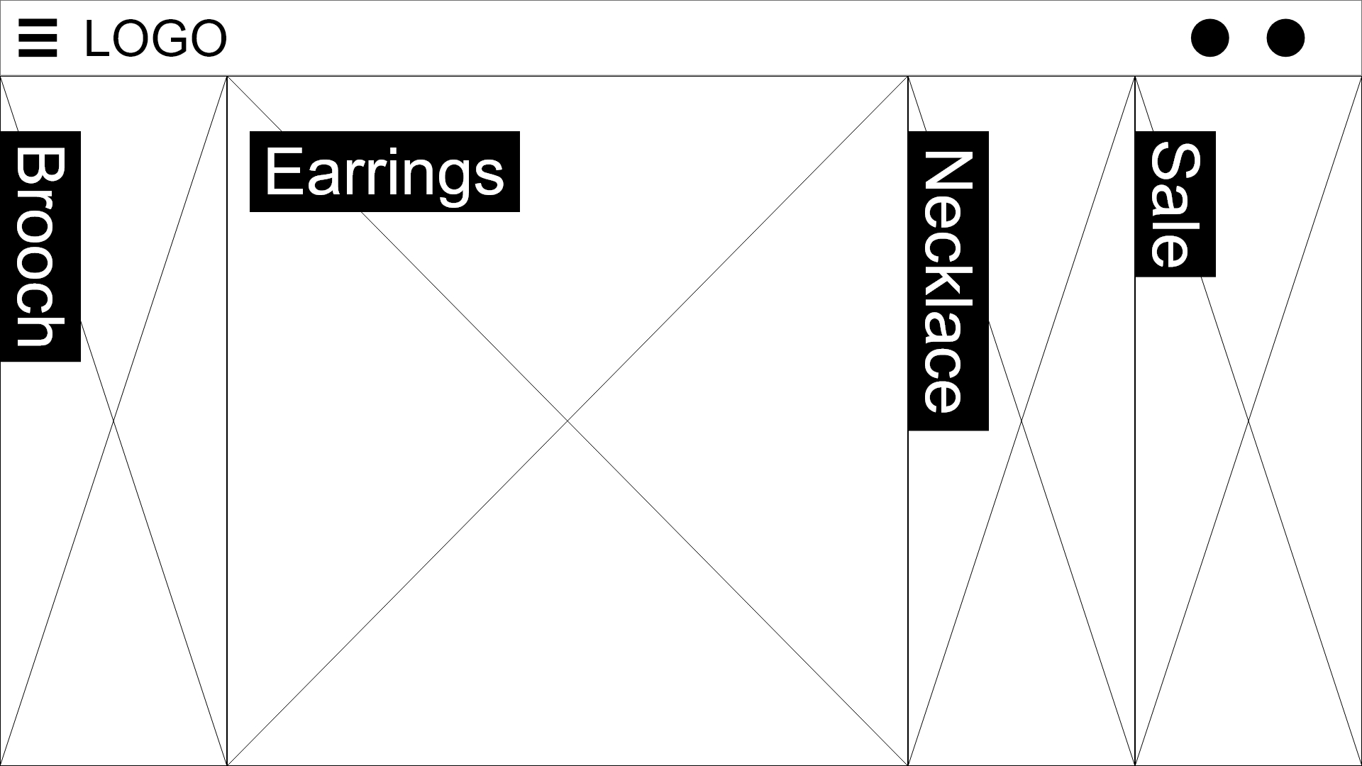
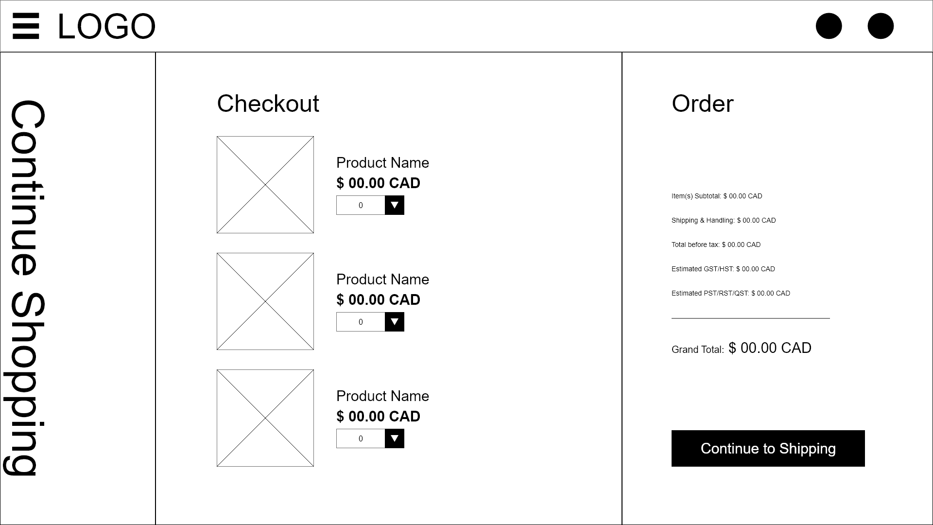
Wireframe
I started by dividing the image into six columns when making the low fidelity line art. The ratio was determined by the number of sections on each page. Based on this principle, I designed four standard layouts to be used on all pages.
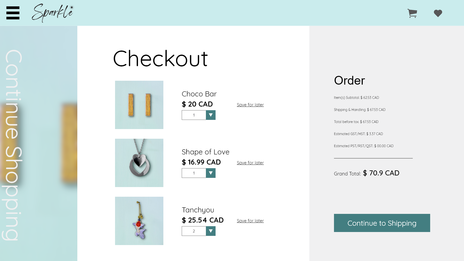
High Fidelity Wireframe
I toned down the middle blue (#7ACFD3) to 40% as the theme colour for the user interface and paired it with black and beige to create a clean, simple pastel tone. The original middle blue and jelly bean blue (#437E81) were used to highlight components that were assumed to attract attention. The index presents a bold look with full-page images and large, clear headings.
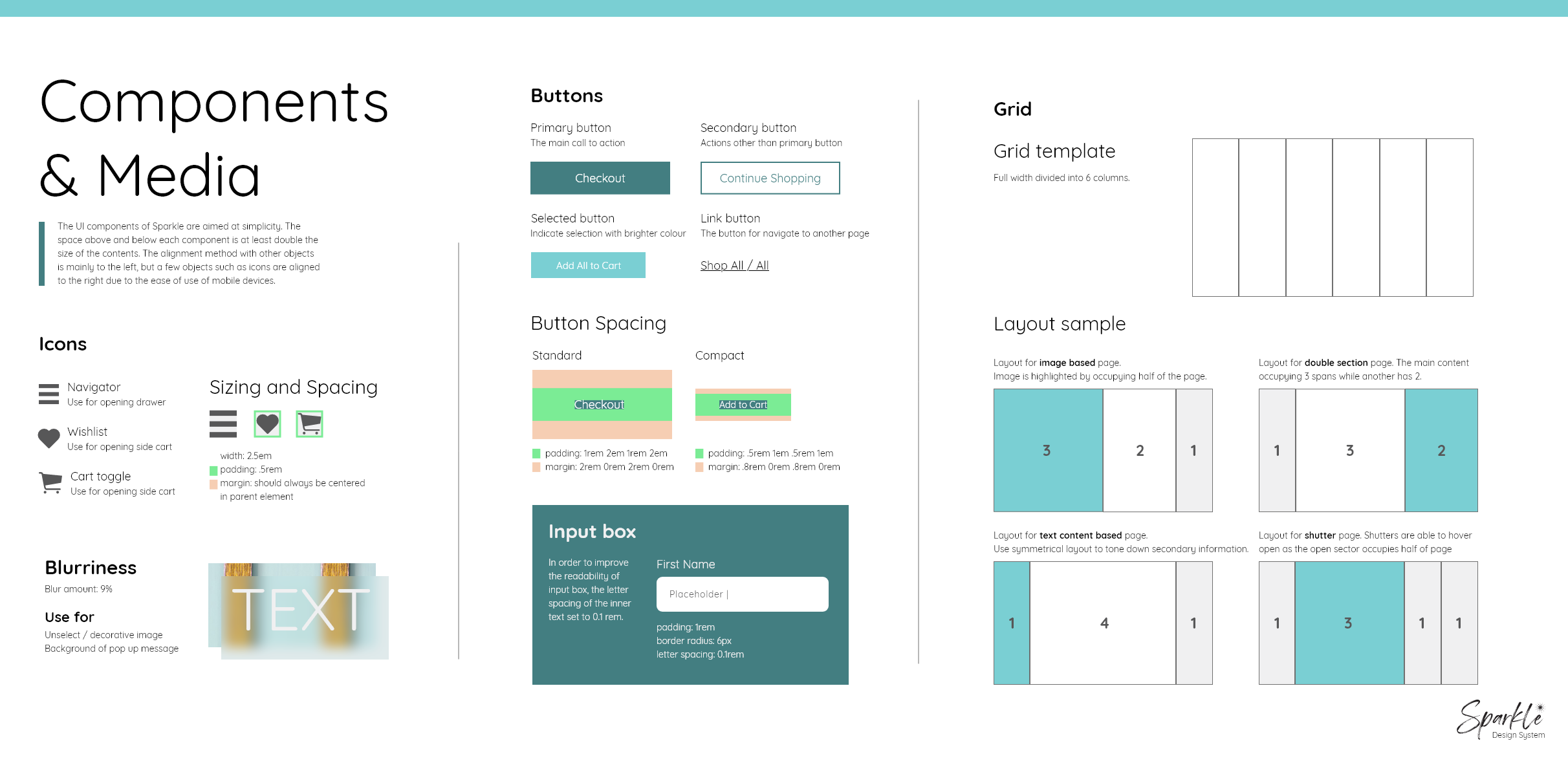
Design System
To have a smooth development process, the system was designed for simplicity and versatility. It ensures the consistency of the components in the web pages during development. Hopefully, enhance the user experience.
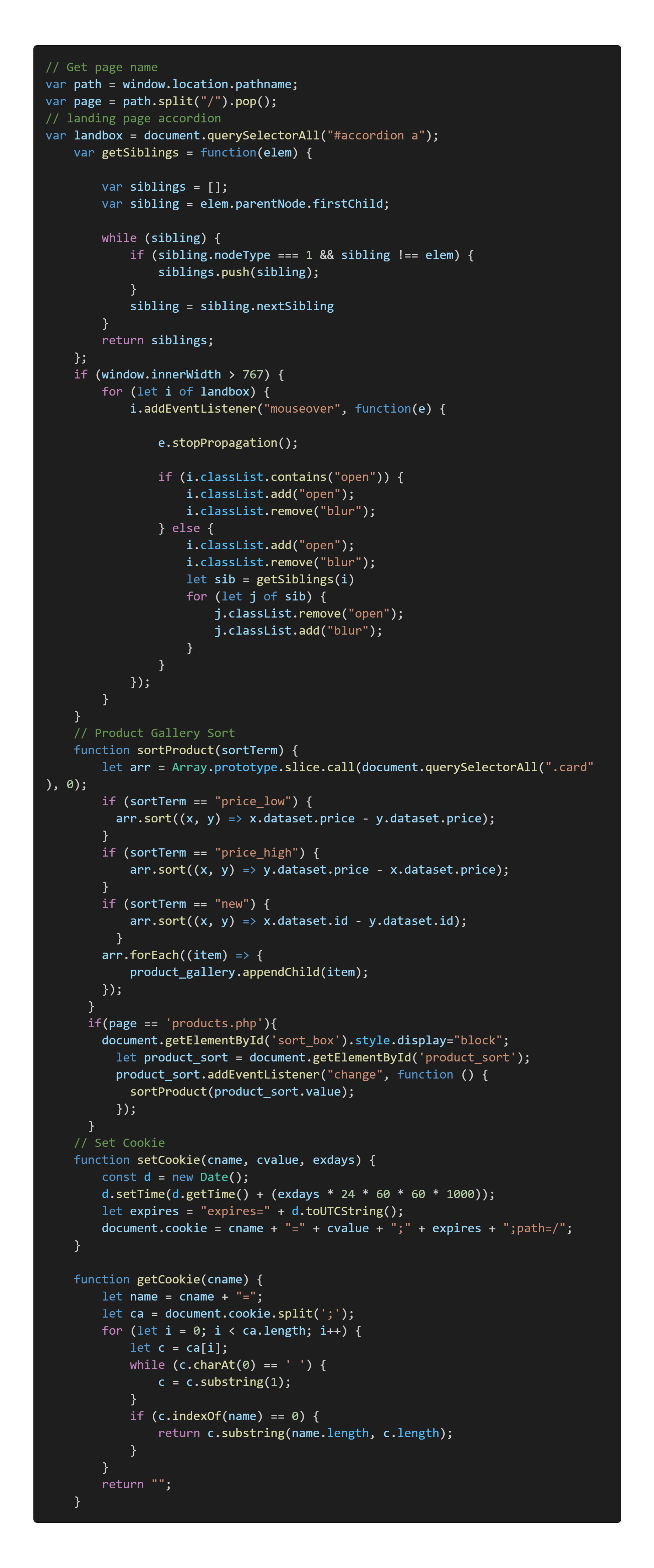
Development
The e-commerce project was developed using HTML, CSS, JavaScript and PHP. In order to ensure that this is a code that can be easily edited in the future, the code management process uses a general-to-detailed approach to organizing the reusable part to ensure that the code is future-proof.
Demo linkContent Creating
In the process of taking product photos, I simultaneously took photos that could be used for advertising. These photos are also based on Sparkle's visual style and are in pastel colours.
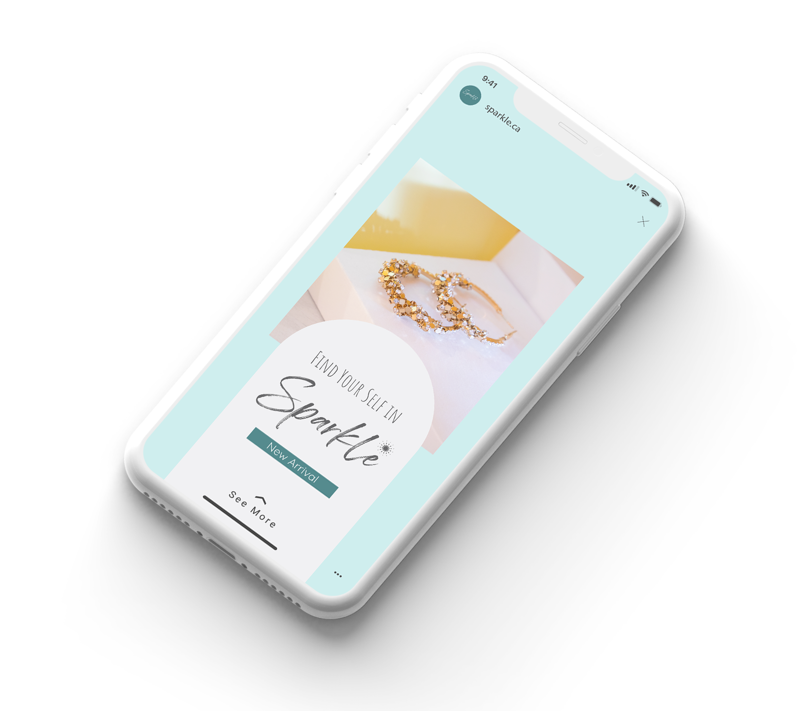
Social Media Post
It is difficult to capture the limited attention of people. I attempted to use slogans and easy-to-understand actions that would appeal to Sparkle's potential customers to drive them to click on the ad.
Lí hó! Ting
About me
Hi! I am Ting-Huei Chen.
A frontend developer that used to be a watch designer.
I love
coding, coding love me.